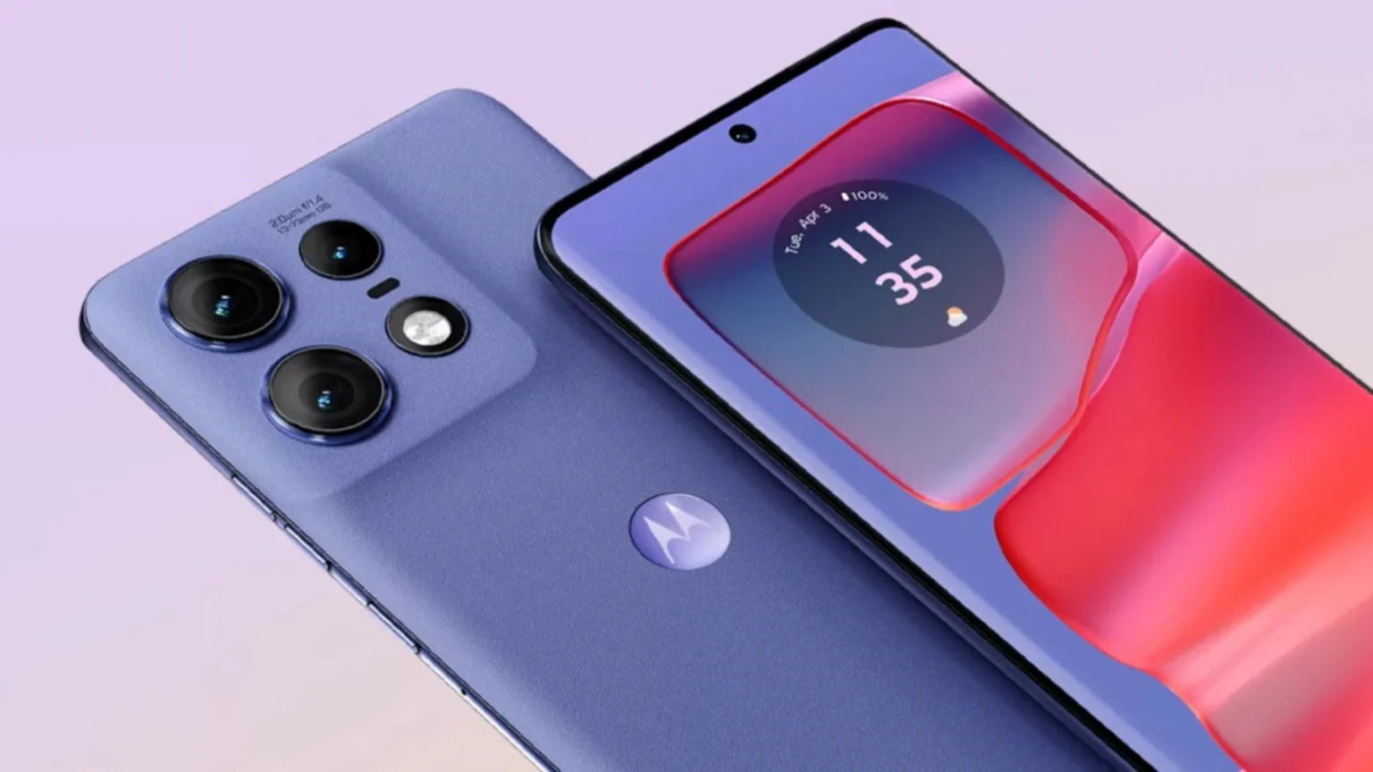
We are accustomed to tech brands partnering with adjacent brands, whether it’s OnePlus with Hasselblad or Honor and Huawei with Porsche Design, and often — such as with Xiaomi and Leica — singing the praises of the resulting collaborations.
But not enough has been said about Motorola’s now established partnership with color experts Pantone.
It was when the recently released Motorola Edge 50 Neo arrived for me to try out that I finally understood how impactful the collaboration has become. Why? It manages to make even ordinary colors look fantastic.
The Edge 50 Neo in my hands is gray. While I like a minimalist tone, gray is not an exciting color, and as someone who also likes a splash of bright color on a smartphone, it’s not one I’d expect to really like. But the Edge 50 Neo isn’t gray, it’s Grisaille.
Apparently, Grisaille is the name given to a particular art style where only different shades of gray are used, and the word is obviously adapted from the French gris, meaning gray.
I didn’t need to look up the name of the color on Motorola’s website either, as the familiar Pantone swatch card stamped on the back of the phone proudly informed me. Is Grisaille gray? No, this is far from the color used to paint battleships, in the same way Porsche’s wonderful Crayon color isn’t just gray either. Grisaille is a medium blue, but refined enough that all but a hint of the blue remains as the darker gray tone emerges.
Motorola doesn’t just slap a bit of Grisaille on the back of the Edge 50 Neo and call it a day. The rear panel is made from vegan leather, but it hasn’t been made to feel like a hardwearing leather. Instead, the material is so soft to touch, and the texture under your finger isn’t overly processed to fake the feeling of expensive leather. Instead it’s its own thing — silky, classy, warm, and grippy. It’s great to find it on the back of a lower-cost phone. It’s a more effective base than plastic or glass to make the color stand out too.
Beyond gray

The fact I can look at a gray smartphone and write about it in this way tells you all you need to know about Pantone’s work with Motorola on colors. While I like Grisaille probably more than I should, the real magic of the partnership is found when the phone comes in one of Pantone’s annual “color of the year” tones.
A few weeks after I received the Grisaille Edge 50 Neo, Motorola announced a version in Pantone’s color of the year 2025 called Mocha Mousse. Believe me, I tried to get a sample of the Edge 50 Neo in Mocha Mousse, but they’re in short supply, and I was very sad. Like Grisaille isn’t gray, Mocha Mousse isn’t brown. No-one would want a brown smartphone, which is color best reserved for coffee beans and bears, anyway. It looks fantastic in the promotional images. Earthy and warm, and understated without being boring.

Viva MagentaJoe Maring / Digital Trends
It’s very different from Pantone’s color of the year 2024, Peach Fuzz, and 2022’s Very Peri, both of which have been used on Motorola phones. However, many people will best remember Viva Magenta, Pantone’s 2023 color of the year. A brilliant vivid mix of maroon and pink with hints of blue, it popped in a way few smartphone colors do today.
Regardless of which Motorola phone it appeared on, it was the color to choose if you wanted to make a statement. We reviewed the Motorola Razr Plus in the color and called it “impossible to ignore.”
All in on color

Motorola has been working with Pantone since 2022. While it could have simply bagged the color of the year and made a few special editions featuring it, the company has taken full advantage of Pantone’s expertise to use unique colors across its entire range and even in the hardware itself. The Edge 50 Neo comes in Pantone-created Latte, Poinciana, and Nautical Blue in addition to the two hues mentioned above. Wondering what color Poinciana is? It’s what would happen if a Viva Magenta phone and a Peach Fuzz phone got together and made their own Moto phone. Motorola has also infused Pantone’s color knowledge into the camera and the screen.
There’s another interesting aspect to the Motorola and Pantone partnership. Colors follow trends, which we see in everything from cars to clothes, but most likely, we appreciate them subconsciously unless we’re fully plugged into the world of art, fashion, and design. By showcasing Pantone’s colors on smartphones, Motorola is exposing us to this otherwise somewhat hidden world in a very open way. I doubt I’d know what Pantone’s 2025 color of the year was without Motorola showing me, but now I’ll likely be more aware of it outside of tech, and I love that it has done this.

Most smartphone companies stick with an established, relatively safe roster of colors and give them names inspired by whatever the marketing team thinks fits the theme. Starlight this and Space that. Motorola has handed all that over to people who know about color, avoiding yet more dull variations of the same thing, and in doing so, has made the subject of color fascinating and its phones eye-catching and exciting — no matter whether you choose the ordinary or the vibrant model.


